art, interview, process beverly 1/6/24 art, interview, process beverly 1/6/24 16 | Artist profile: Agnieszka Gasparska Agnieszka Gasparska | Artist Profile Read More art, interview, process beverly 11/15/23 art, interview, process beverly 11/15/23 15 | Artist profile: Terran Last Gun Terran Last Gun | Small works at studio light | space Read More art, interview, process beverly 9/29/23 art, interview, process beverly 9/29/23 14 | Artist profile: Tim Schwartz Read More art, interview, process, Ben Dallas beverly 8/23/23 art, interview, process, Ben Dallas beverly 8/23/23 13 | Artist profile: Ben Dallas Read More design, poetry, art beverly 2/24/23 design, poetry, art beverly 2/24/23 12 | a book + links recommended reading Read More beverly 1/5/23 beverly 1/5/23 11 | a field guide: five gardens to visit Tucson, AZ Read More Newer Posts Older Posts
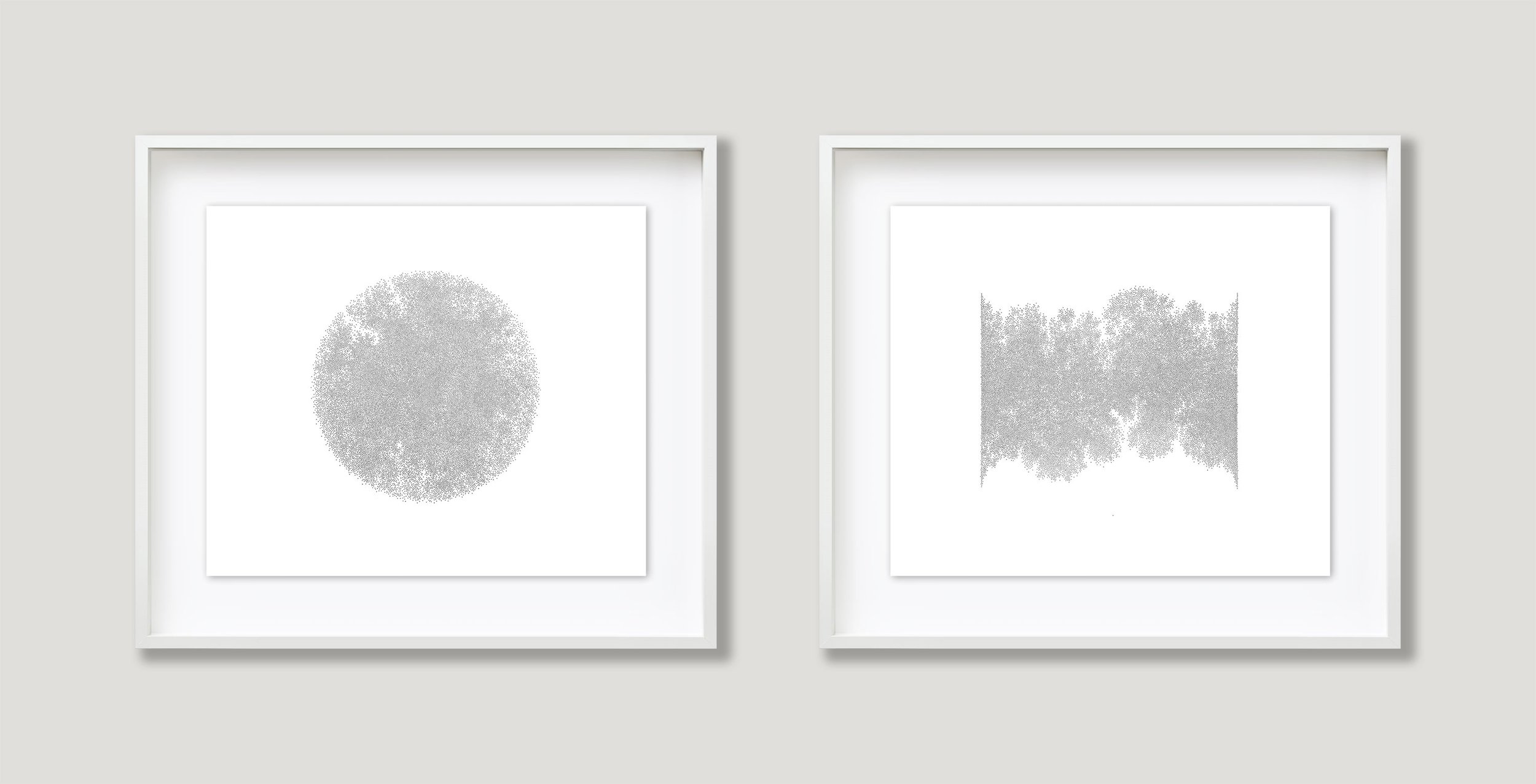
art, interview, process beverly 1/6/24 art, interview, process beverly 1/6/24 16 | Artist profile: Agnieszka Gasparska Agnieszka Gasparska | Artist Profile Read More
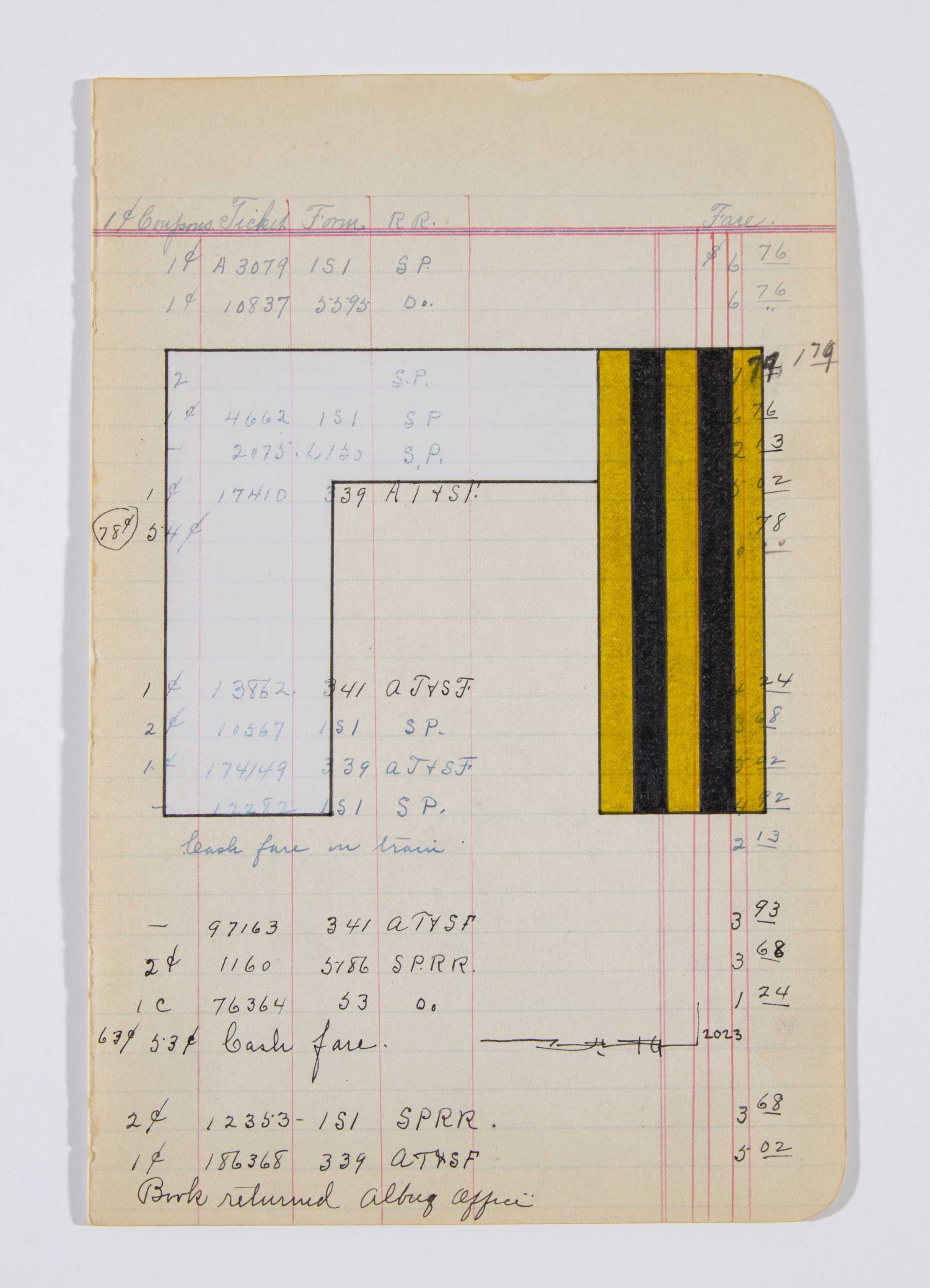
art, interview, process beverly 11/15/23 art, interview, process beverly 11/15/23 15 | Artist profile: Terran Last Gun Terran Last Gun | Small works at studio light | space Read More
art, interview, process beverly 9/29/23 art, interview, process beverly 9/29/23 14 | Artist profile: Tim Schwartz Read More
art, interview, process, Ben Dallas beverly 8/23/23 art, interview, process, Ben Dallas beverly 8/23/23 13 | Artist profile: Ben Dallas Read More
design, poetry, art beverly 2/24/23 design, poetry, art beverly 2/24/23 12 | a book + links recommended reading Read More