art, interview, process beverly 1/6/24 art, interview, process beverly 1/6/24 16 | Artist profile: Agnieszka Gasparska Agnieszka Gasparska | Artist Profile Read More art, interview, process beverly 11/15/23 art, interview, process beverly 11/15/23 15 | Artist profile: Terran Last Gun Terran Last Gun | Small works at studio light | space Read More art, interview, process beverly 9/29/23 art, interview, process beverly 9/29/23 14 | Artist profile: Tim Schwartz Read More art, interview, process, Ben Dallas beverly 8/23/23 art, interview, process, Ben Dallas beverly 8/23/23 13 | Artist profile: Ben Dallas Read More inspiration, music, materials, tactility beverly 8/9/21 inspiration, music, materials, tactility beverly 8/9/21 04 | desert rain 04 | summer rain Read More
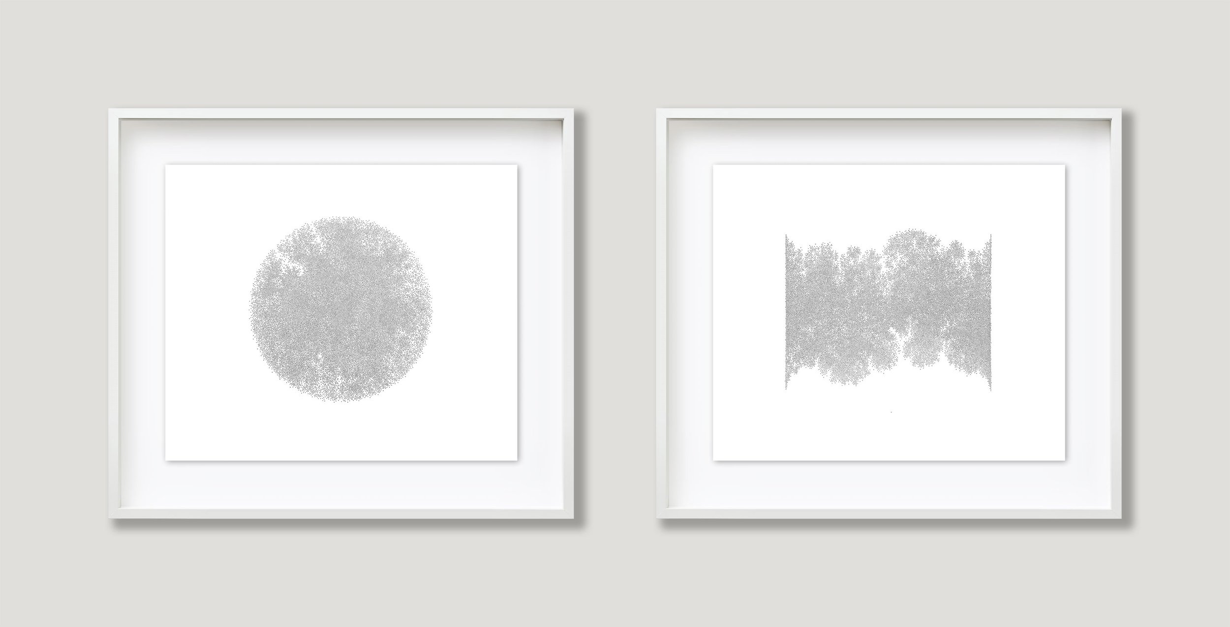
art, interview, process beverly 1/6/24 art, interview, process beverly 1/6/24 16 | Artist profile: Agnieszka Gasparska Agnieszka Gasparska | Artist Profile Read More
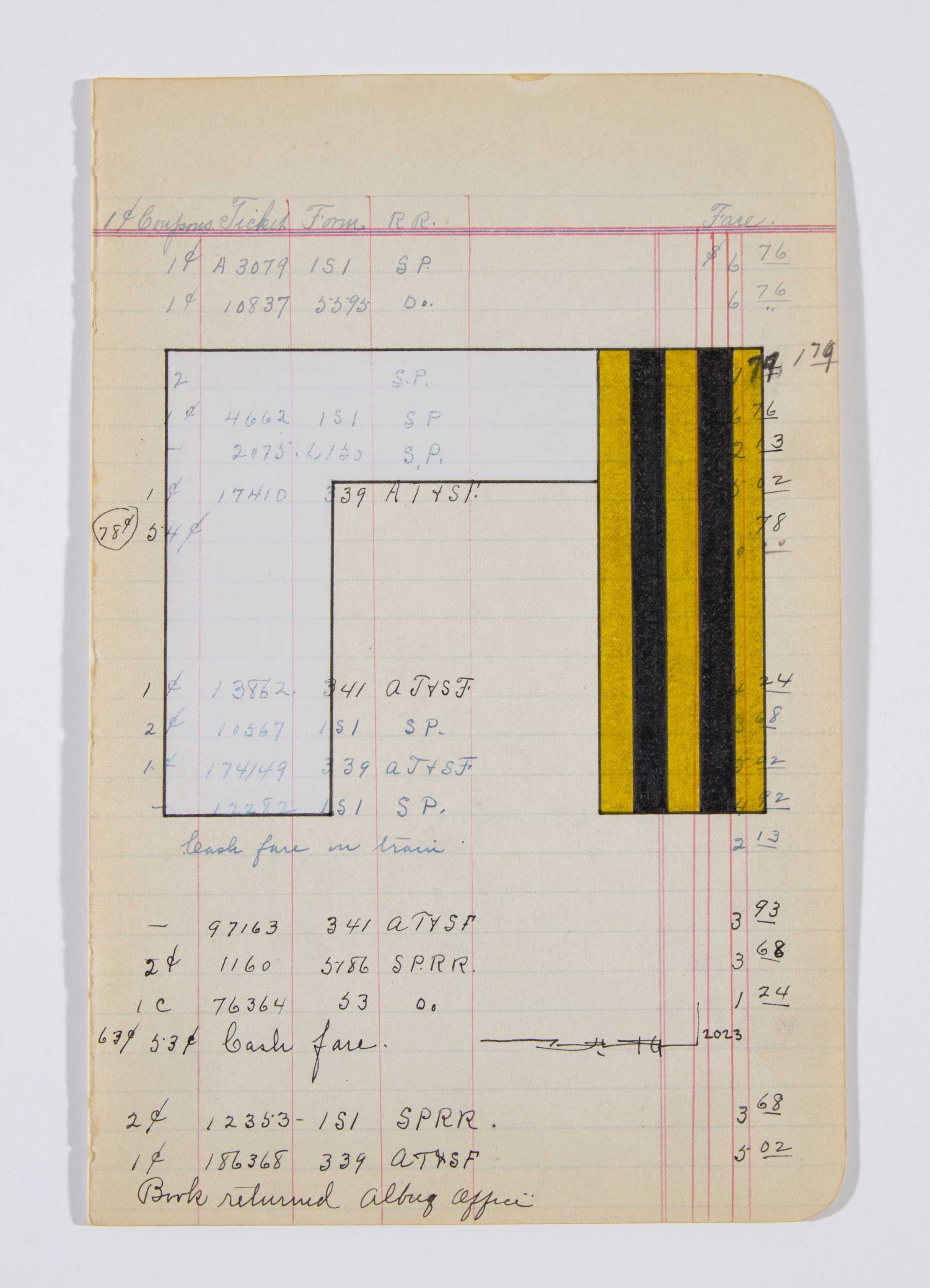
art, interview, process beverly 11/15/23 art, interview, process beverly 11/15/23 15 | Artist profile: Terran Last Gun Terran Last Gun | Small works at studio light | space Read More
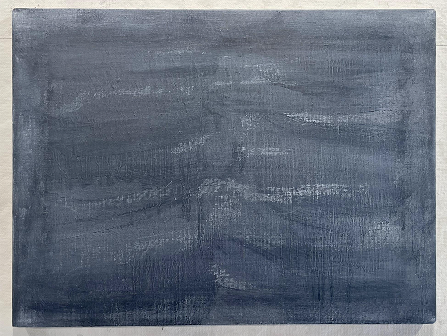
art, interview, process beverly 9/29/23 art, interview, process beverly 9/29/23 14 | Artist profile: Tim Schwartz Read More
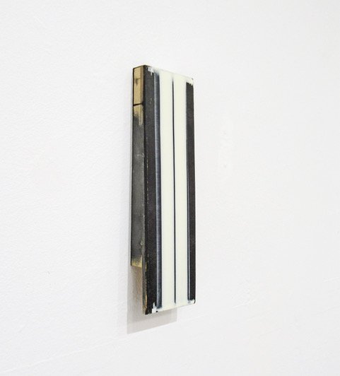
art, interview, process, Ben Dallas beverly 8/23/23 art, interview, process, Ben Dallas beverly 8/23/23 13 | Artist profile: Ben Dallas Read More
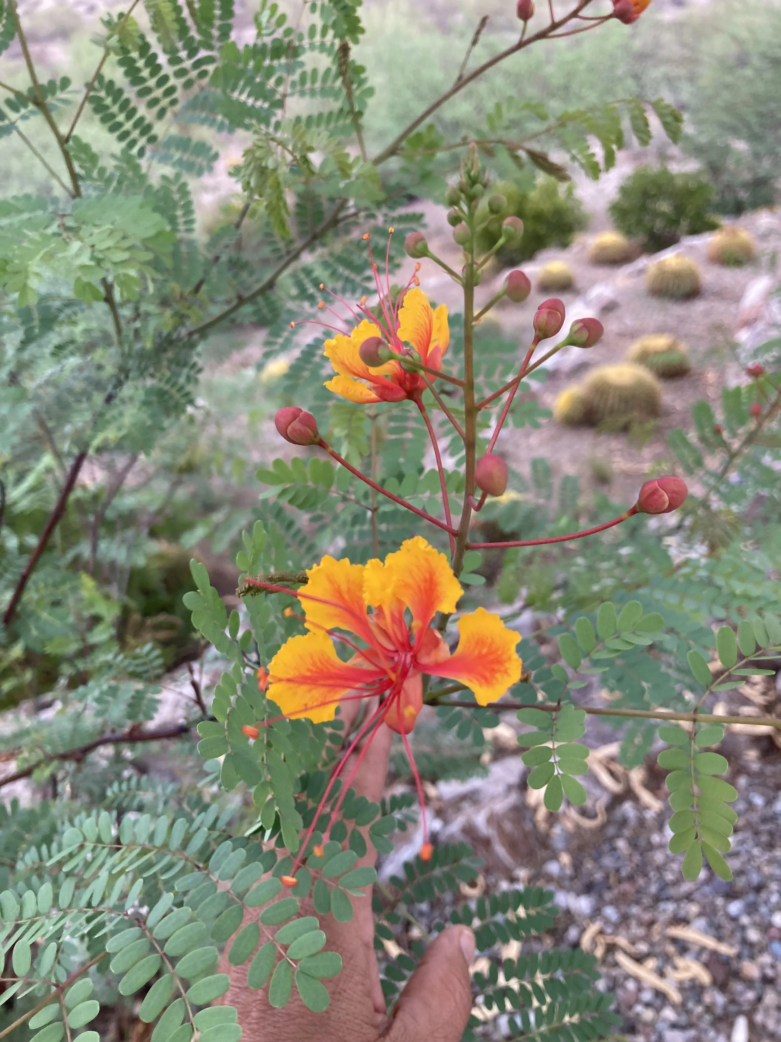
inspiration, music, materials, tactility beverly 8/9/21 inspiration, music, materials, tactility beverly 8/9/21 04 | desert rain 04 | summer rain Read More